Everyone wants to have a beautiful and selling landing page. You can expect great design.
So why do some landing pages not give conversions? It's time to find out and fix the errors.
1. The audience
Before you begin to develop (or remake) your landing page, take a break and mentally set off from all ideas.
Spend some time thinking about your strategy again:
- Who are you creating this whole page for? Are you sure you know exactly who your target audience is? You’ll get pretty low conversions. Therefore, it is necessary to specify the portrait of the target consumer as much as possible.
- Why should people desire your product? Most likely, you really concentrated. Do not forget that you need to think first of all about the user.
- What are your goals? Once you have noted the goals of your open audience, combine them with yours. Obviously, you need a conversion, and you need to set a goal for yourself: "I want to get as much as you need."
2. Do not write a lot of text
These are usually quite short and limited visual effects. Why should the text be small and simple?
The purpose of the landing is to convert long or distracting content can lead to a rebound (Jenn Villa)
Marketers argue that decision-making requires a low level of commitment. When you assume that the risk of sharing personal information is higher.
Can't reduce your content? Here are some suggestions:
- Reduce the number of paragraphs. Large fragments of text into smaller, but "bright" and clear sentences or markers are added for easy reading. Remember: your landing page should be concise.
- Get rid of unnecessary words. Leave your desktop for a few hours. Now remove all unnecessary! If you can express your thoughts using fewer words.
- Try adding a video. While reading text, users enjoy entertaining and informative videos. This should be short and attractive, otherwise you will not be able to keep your potential client.
3. Keep the call to action button prominently
After you propose a draft proposal that you think it will be difficult to refuse, concentrate on the call to action button (call to action).
CTA more attractive:
- Hold the CTA at the top of the page. I want to say that the call to action is at the top of the page. The likelihood that someone will see the CTA (especially if the page does not have clear visual indications, in the form of an arrow, for example, that when scrolling down you can find something else).
- Use active verbs. You use this "active" language. Try using words such as “Receive (e-book)”, “Request (consultation)”, “Register (on our mailing list)” instead of “Receive”, “Click here”, etc.
- Do not forget about the design. Choose a bright color for the CTA button or better your corporate one. If you refer to an existing or target site, this should not cause dissatisfaction, so always pay attention to the design.
4. Give users evidence
Regardless of how the potential customer behaves on your page, he subconsciously wants to see evidence. What evidence? In fact, this is all that hints or clearly shows the superiority of your product / service to quality. This encourages your potential customers to trust your brand.
Add a slider carousel at the bottom of your landing page to display reviews. You can show your partner partners with whom you work, and how they use your wonderful product / service. It is also appropriate to place your company’s awards, certificates and letters of appreciation.
Act as you wish ...
Some sites include clickable links in their landing pages that send users to case studies, video reviews, etc., in order to tell more about their company. Also on the page can be displayed icons of social networks indicating the number of subscribers or reviews that make it possible to go to these platforms.
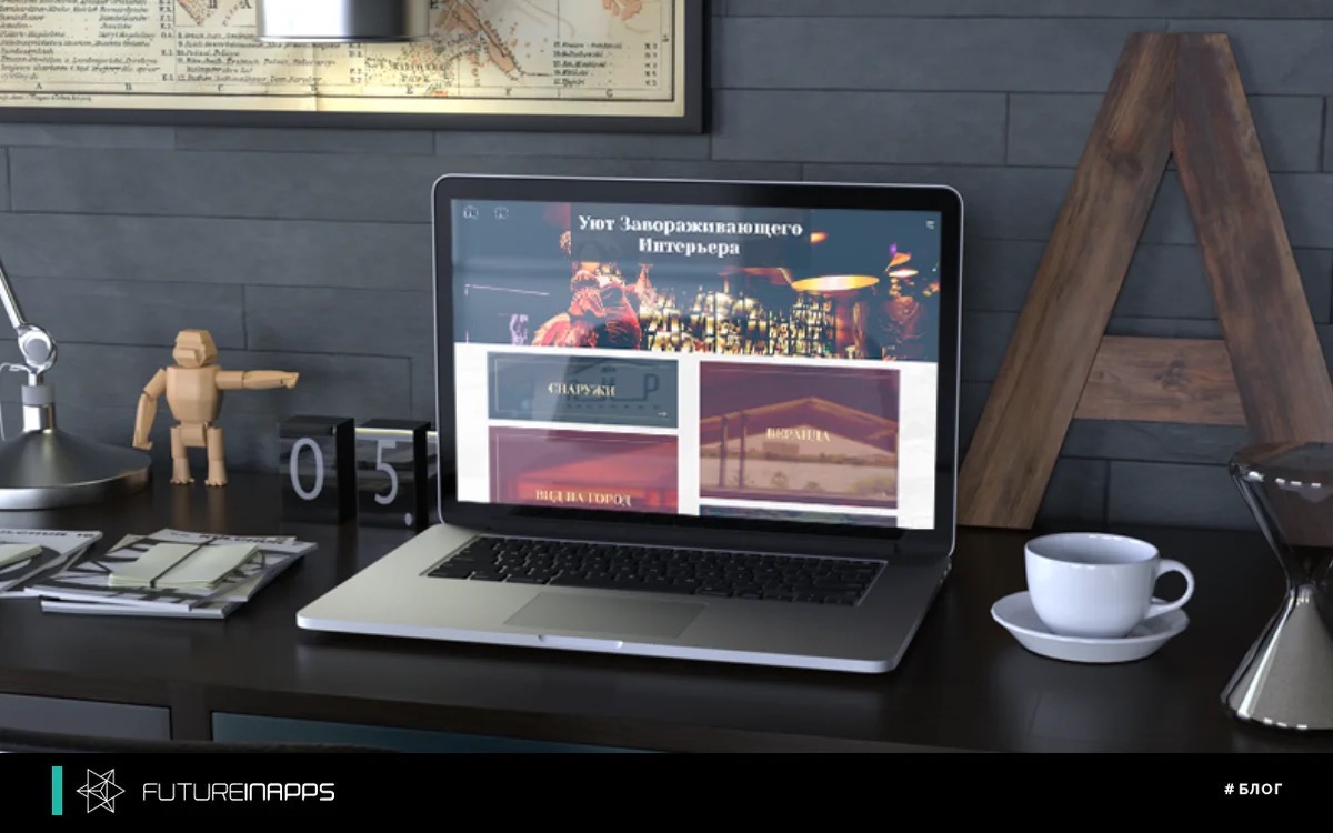
5. Make the page visually appealing
Even if your text is small and enticing, people will immediately leave the landing page if the content will not attract them visually. That is why landing pages that give the highest conversion usually have a strong visual component.
You can add graphics to your landing page. Here's what you need for this:
- Set the image of the product / service. Landing page templates can display images of any shape and size. Therefore, choose a template suitable for yourself that will suit your style.
- Create a visual accompaniment. Infographics is one of the best tools for delivering information without words, but you should not neglect stock images either.
- Add a video. Instead of or in addition to the image, try adding a short but useful video to bring more information about your landing page, while avoiding the huge text.
- Use your signature colors. Make sure that you use the exact colors that are used to design your branding.
6. Set up your workflow correctly.
Now that you have the right content and visual elements, a feedback form, try to test your landing page on yourself. Go all the way that your potential client will follow before deciding to submit the form. View your Thank you page, upload the offer, receive emails, track the goods, etc.
Now answer yourself the following questions:
- Are leads counted in your CRM system?
- Is information coming from users correctly? Do I need to fix something in the survey form, change the fields?
- Do responsible employees in your company receive a notification about a new lead?
- Is the workflow set up correctly after receiving conversions? Is there a lead analysis system to expand your company’s sales and marketing opportunities in the future?
Surprisingly, in fact, most marketers do not test their workflows and only after months discover one of the main problems, because of which they did not receive any leads. Therefore, do not be like them. Look for any pitfalls, everything that your potential customers may encounter, and eliminate it before you launch your landing page.
7. Check the display of the landing page on all types of devices
If the user needs to reduce or, on the contrary, enlarge the image in order to get acquainted with the information or fill out the form, most likely he will simply close your page.
Be sure to see how your landing page is displayed on different types of smartphones and tablets, as well as on computer screens with different diagonals.
You may need to redo your page to improve the user interface. For example, for mobile users, a page with less text and large buttons is suitable. You can also crop images that are too large to load and slow down the loading speed of your site.
8. Look for inspiration from professionals.
It is said that inspiration begins with imitation. Check out some cool landing page examples to think about the design and functionality for yours. Make notes for yourself that you liked the work of the best of the best. And do not limit yourself to just viewing screenshots of landing pages in compilation articles, be sure to visit the page itself.
Some pros in this business go beyond the traditional methods of working with landing pages. Although experiments are always interesting, be careful not to go too far from the standards until you test several versions of your own.
These 8 simple guidelines will certainly help you create an original high conversion landing page.